Dashboard
The Quine dashboard is the landing page you see when you first open the UI. It gives a live snapshot of what your instance is doing.
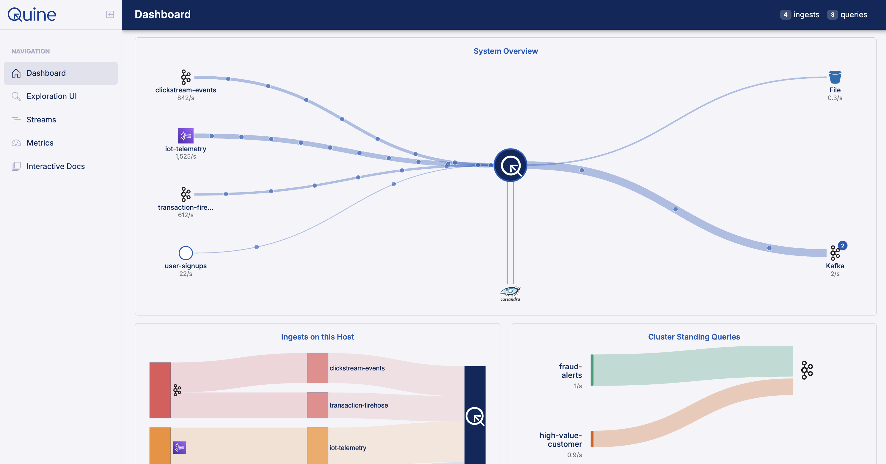
A summary bar at the top shows live counts of active ingests and standing queries. Hovering over those badges gives a quick status breakdown.
What's on the page
System Overview: an animated diagram tracing data as it moves from your ingest sources through Cypher processing to the persistor. It shows each ingest and standing query by name, the database type (e.g. RocksDB, Cassandra), and live persistor read/write latency and ops/sec. Useful as a quick sanity check that data is actually flowing end-to-end.
Ingests: a Sankey diagram with three columns: source types on the left (Kafka, S3, etc.), ingest stream names in the middle, and the Quine node on the right. Link thickness represents the one-minute ingestion rate, so you can see at a glance which streams are busiest. Hovering a node shows a breakdown of rate, total ingested count, and per-stream status (Running, Paused, Restored, Failed).
Standing Queries: a flow diagram connecting each standing query on the left to its output destinations on the right (e.g. Kafka topics). Bar height and line thickness reflect match rate. Idle queries (rate of zero) are shown as thin grey lines so you can still see what's wired up. Hovering a query shows its match rate and output list; hovering a link shows the rate and workflows on that specific connection.
Host Metrics: three progress bars: total JVM memory, heap usage, and shard node counts (soft and hard limits). Hovering any row shows the raw byte values alongside the percentage, and the shard row expands to a per-shard breakdown.
Other pages
The sidebar gives you access to the rest of the UI:
- Explorer (
/explorer): interactive graph query and visualization - Metrics (
/metrics): deeper JVM and shard metrics with histograms - Streams (
/streams): create and manage ingest streams and standing queries - Docs (
/docs): interactive OpenAPI docs for the V2 API